Client
OpinionLab
Services
- Branding
- Brand Guidelines
- Print Design
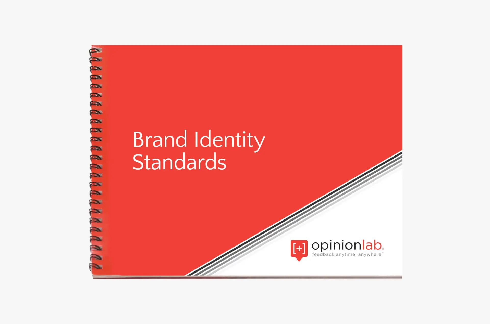
Opinionlab, a leading voice of customer company, understands the importance of a strong brand identity that resonates with its target audience. Through meticulous branding guidelines, Opinionlab ensures consistency across all touchpoints, reinforcing its values, mission, and unique offerings. This case study delves into the comprehensive branding strategy developed for Opinionlab, covering key elements such as brand identity standards, white papers for key industries, supporting icons, signature, letterhead, and website best practices.
Logo
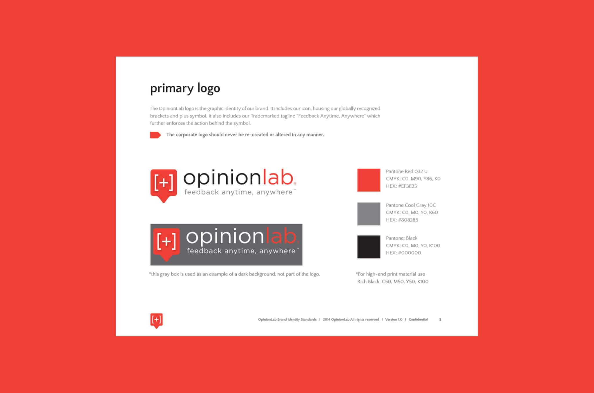
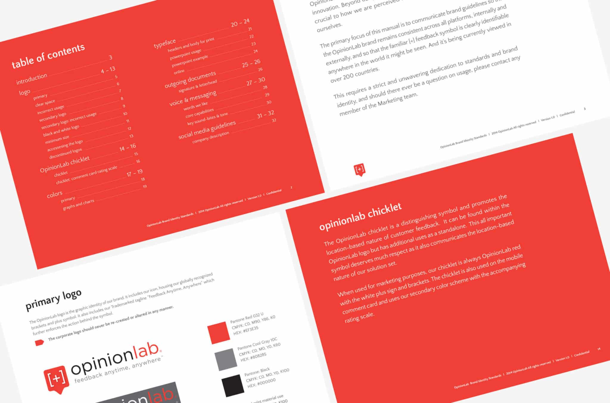
- The Opinionlab logo is the cornerstone of its brand identity, representing trust, innovation, and customer-centricity.
- The logo should always be displayed in its approved colors and proportions, maintaining legibility and clarity across various applications.
- Clear space around the logo must be maintained to ensure visibility and impact.
Typography
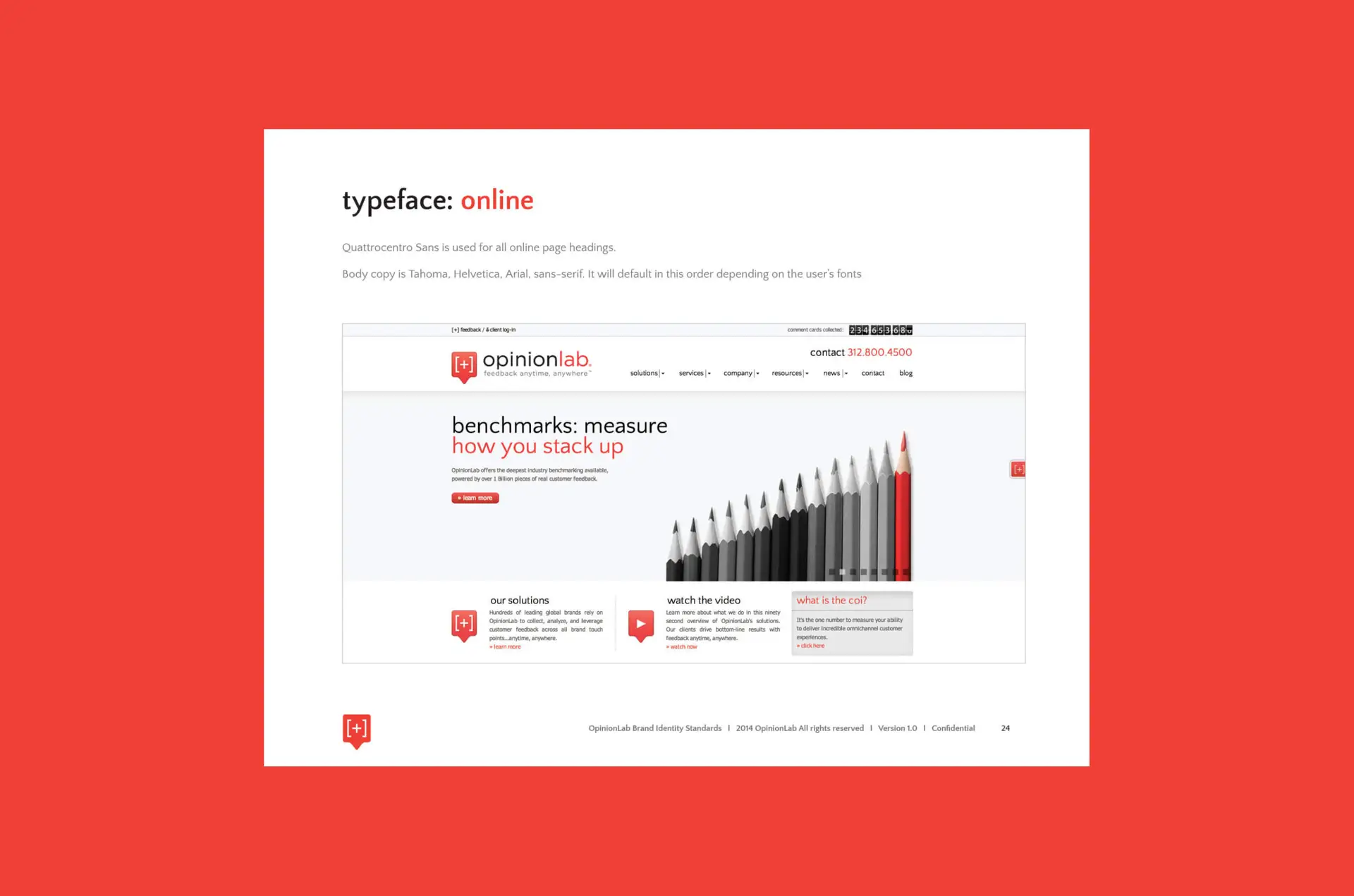
- The primary font for Opinionlab is Quattrocentro Sans, chosen for its modern yet approachable aesthetic.
- Secondary fonts are Gotham Book and Gotham Medium, to be used for supporting text and body copy respectively.
- Font sizes and weights should adhere to the provided guidelines for consistency in communication.
Color Palette
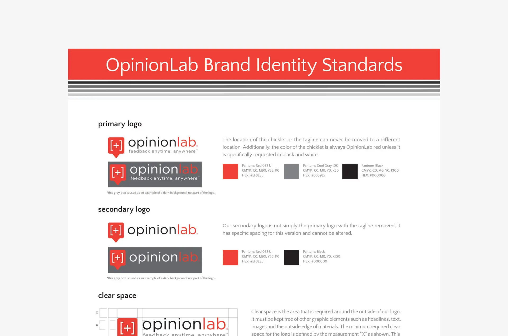
- Opinionlab’s color palette reflects its brand personality.
- These colors should be utilized consistently across all branding materials, evoking the desired emotional response from the audience.
Opinionlab Chicklet
- The Opinionlab Chicklet serves as a supporting icon to the logo, representing feedback, insights, and customer engagement.
- It should be displayed consistently alongside the logo, maintaining its size and proportions.
White Papers for Key Industries
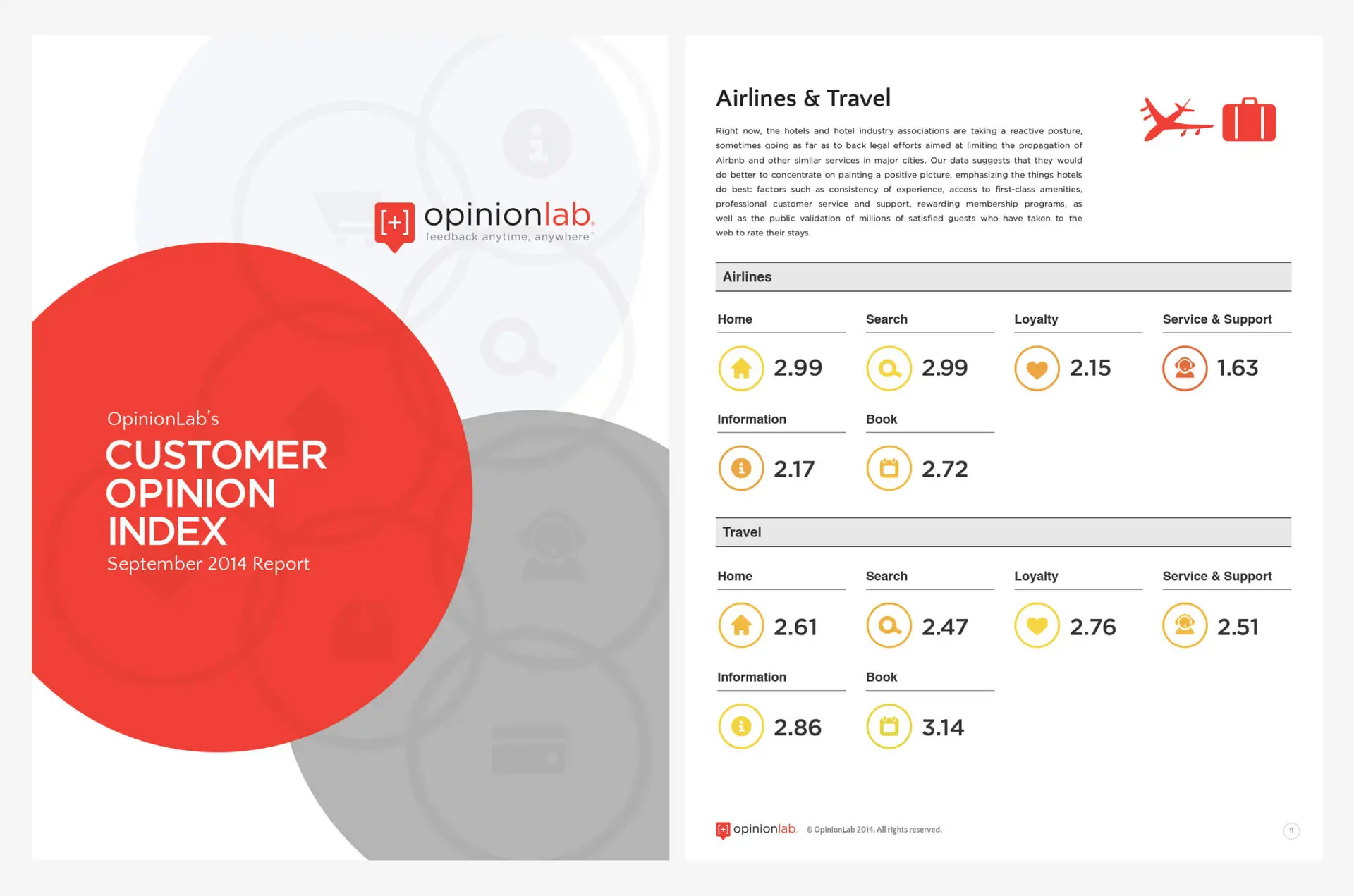
- Opinionlab’s white paper for the Airlines & Travel industry addresses crucial customer experience challenges specific to this sector.
- The content should be informative, data-driven, and tailored to the needs of airline and travel professionals.
- Visual elements and case studies should be incorporated to enhance understanding and engagement.
Signature and Letterhead Best Practices
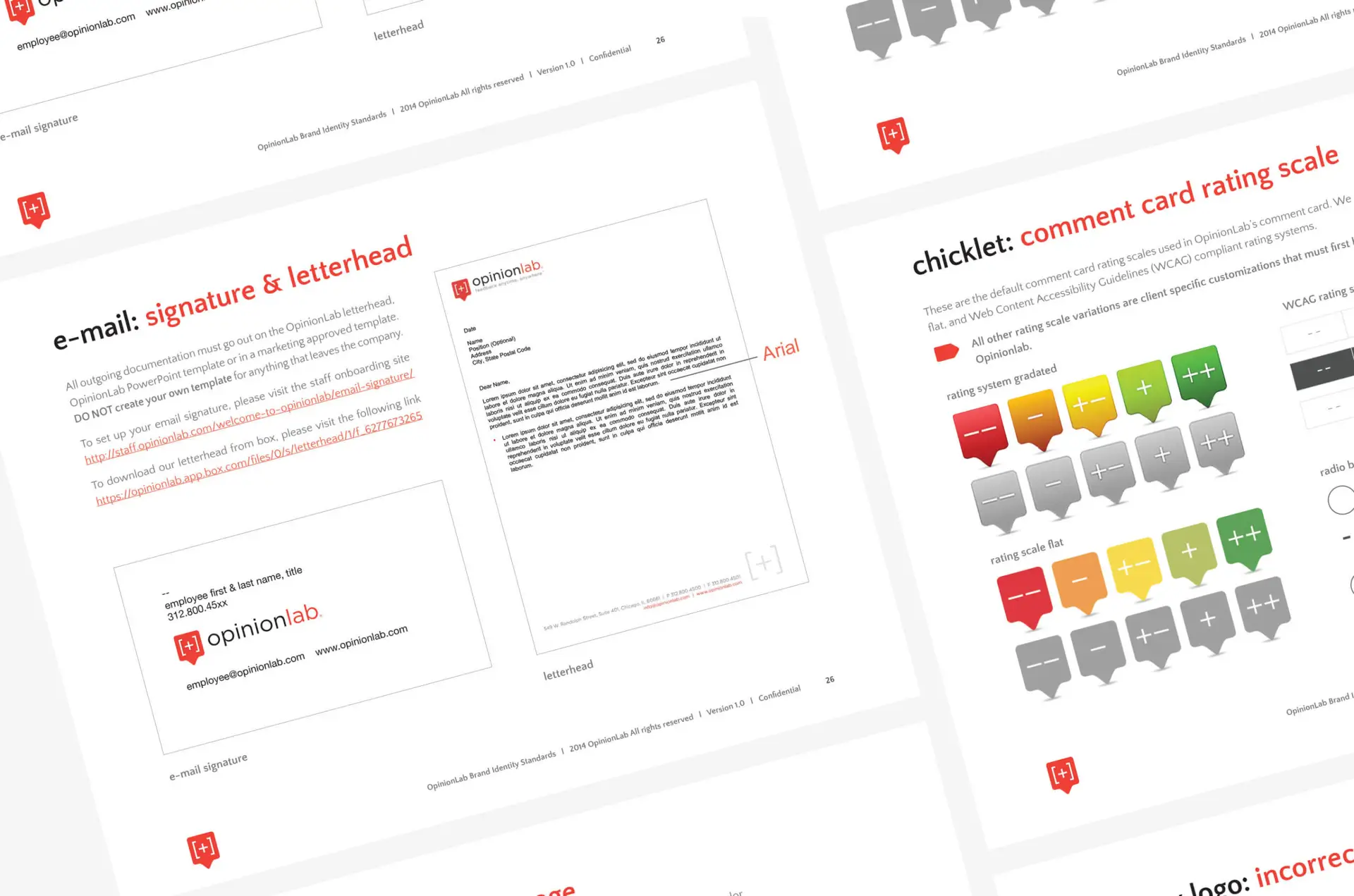
- Opinionlab’s email signature should include the employee’s name, title, contact information, and a link to the company website.
- The logo and Chicklet should be incorporated into the signature for brand visibility.
- Opinionlab’s letterhead design should feature the logo, Chicklet, and contact information prominently.
- Consistent use of typography, color, and visual elements should be maintained for a professional appearance.
Website Best Practices
- The website should have intuitive navigation, allowing users to easily find relevant information and resources.
- Content should be well-organized, concise, and informative, catering to the needs of Opinionlab’s target audience.
- Visuals such as images, videos, and infographics should be used to enhance engagement.
- The website should be optimized for various devices and screen sizes to ensure a seamless user experience.
Conclusion
Opinionlab’s branding guidelines serve as a blueprint for maintaining consistency and coherence across all brand touchpoints. By adhering to these guidelines, Opinionlab reinforces its brand identity, strengthens its market position, and builds trust with its audience. Through strategic implementation of branding elements in white papers, supporting icons, signature, letterhead, and website design, Opinionlab continues to differentiate itself in the competitive landscape of voice of customer solutions.
