Client
Torres Construction
Services
- Branding Identity
- Graphic Design
Torres Construction is a reputable construction company based out of Seattle, Washington, specializing in residential and commercial construction projects. With a commitment to quality craftsmanship and client satisfaction, Torres Construction has established itself as a trusted name in the industry.
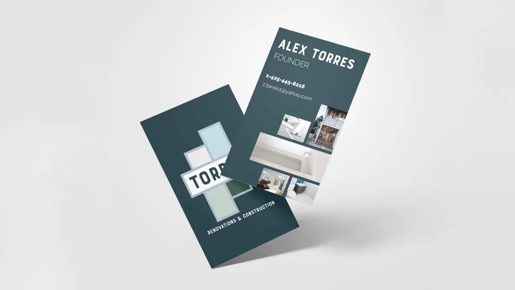
Objective: The objective of this branding design project was to create a cohesive visual identity for Torres Construction that reflects its professionalism, reliability, and commitment to excellence. The design elements included business cards, stationery, truck design, pattern, and merchandise.
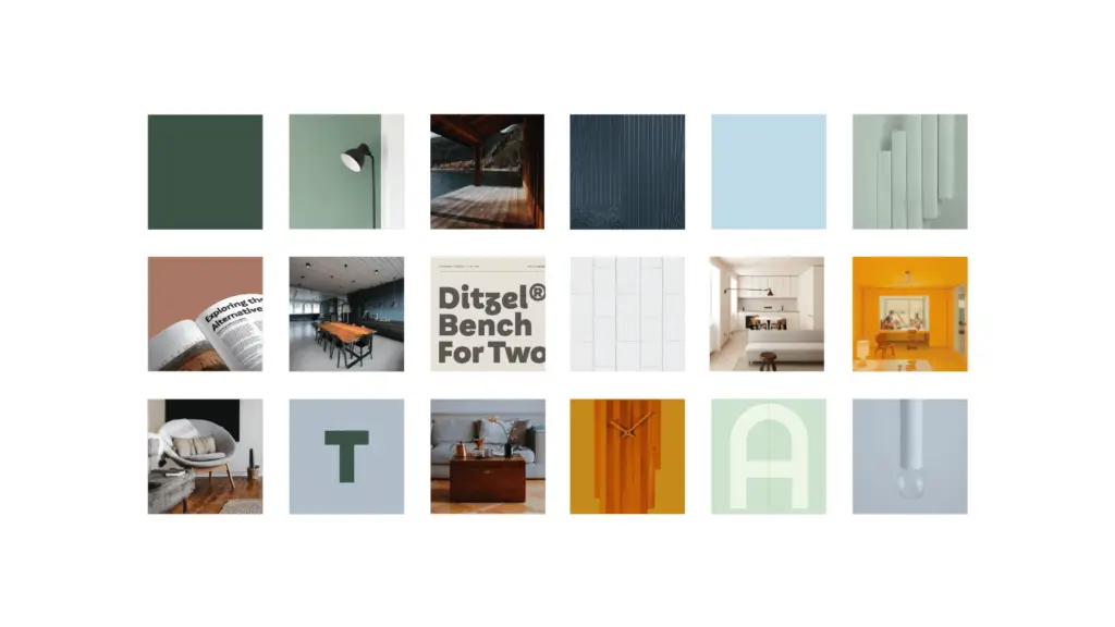
Style Scape and Color Scheme: The style scape for Torres Construction drew inspiration from the company’s core values of reliability, professionalism, and excellence. The design elements were clean, modern, and sophisticated, reflecting the company’s commitment to quality craftsmanship.
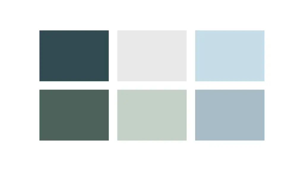
Color Scheme: The color palette chosen for Torres Construction was a combination of bold and muted tones, symbolizing strength, stability, and trustworthiness. The primary colors included deep navy blue, representing professionalism and dependability, and cool gray, signifying stability and reliability. Accents of evergreen were incorporated to add a touch of luxury and sophistication, reflecting the company’s commitment to excellence.
Design Elements:
- Business Card: The business card design for Torres Construction featured a clean layout with the company logo prominently displayed at the center. The logo was created using a combination of bold typography and sleek patterned lines, reflecting the company’s modern approach to construction. The navy blue background provided a striking contrast to the green and gray accents, creating a memorable and professional impression.

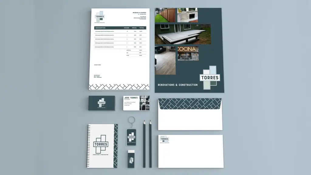
- Stationery: The stationery design followed a similar aesthetic to the business card, with the company logo prominently featured on letterheads, envelopes, and other stationery items. The use of consistent typography and color scheme across all stationery items reinforced the brand’s identity and professionalism.
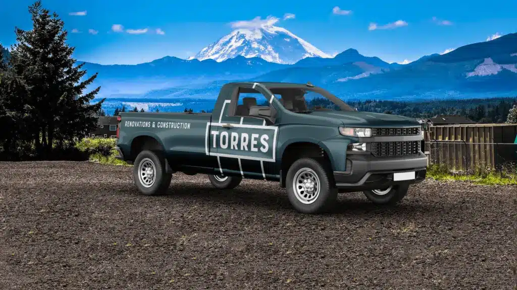
- Truck Design: The truck design for Torres Construction was an important aspect of the branding strategy, as it serves as a mobile billboard for the company. The design featured the company logo and contact information prominently displayed on the sides and back of the truck, ensuring maximum visibility and brand recognition. The bold navy blue background and gray accents made the truck stand out on the road, effectively promoting the company’s services to a wide audience.
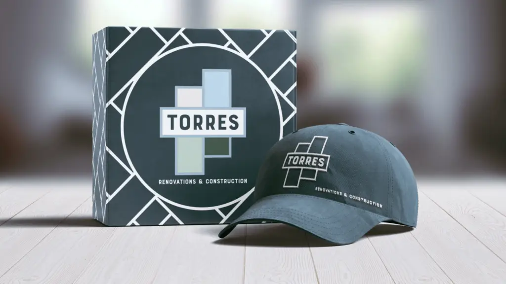
- Pattern: A custom pattern was created for Torres Construction to be used across various branding materials, including website backgrounds, promotional materials, and merchandise. The pattern incorporated geometric shapes inspired by architectural elements, symbolizing the company’s expertise in construction. The navy blue, white and gray color scheme added a touch of sophistication to the pattern, further reinforcing the brand’s identity.
- Merchandise Creation: Merchandise such as branded apparel, hats, and construction gear were designed to further promote the Torres Construction brand. The merchandise featured the company logo prominently displayed, along with the custom pattern as accents. The use of high-quality materials and attention to detail reflected the company’s commitment to excellence in everything it does.
Conclusion: The branding design for Torres Construction successfully achieved the objective of creating a cohesive visual identity that reflects the company’s professionalism, reliability, and commitment to excellence. The clean and modern design elements, combined with a bold color scheme, effectively communicate the brand’s values and set it apart from the competition. From business cards to truck design and merchandise creation, every aspect of the branding design reinforces the Torres Construction brand and leaves a lasting impression on clients and stakeholders alike.
